

Introducing ORCA's macro dashboard

As I’ve emphasized over the last few weeks, we are in a clear grind-up environment, driven by excellent earnings and a host of momentum-triggered indicators driving everything up. The Iran war is still very much on, but as far as the market is concerned, it was over exactly when game theory predicted it would be over - in case you missed it, read it here.
The economy is accelerating (GDPNow is at 3.7%), inflation is also higher, but unemployment seems to have stabilized after Friday’s latest employment report. It came in unchanged at 4.3%, with 115k new jobs added (higher than the expected 60k). This shifted rate expectations into an alignment I haven’t seen in a while - markets are pricing in two years of unchanged interest rates:
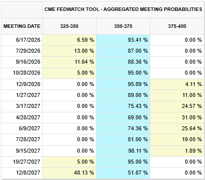
That’s not gonna stay like that for too long. At least there are no more expectations of rate hikes in 2026, so that was some good news.
So with semis leading the way (NASDAQ is killing it, already close to 15% YTD), there is ample euphoric behavior out there. Which, in itself, is cause for concern. But the structure beneath is still unchanged. Great earnings, economy doing well, inflation still high - seems awfully like higher for longer from 2023. And if you recall, higher for longer was not bad for equities at all. It was bad for bonds, but equities did pretty well. Especially as AI capex is pulling things along.
Which brings me to my main topic for today - introducing Oraclum’s Macro Dashboard (working name): the ultimate toolkit to recognize a macro regime and position your portfolio accordingly.
Available only on this newsletter, free for all our subscribers primarily as a learning tool.
NOTE: there will be a section for paid subscribers, we’re getting there, and I’m happy to hear all feedback on this.
As many of you know, I do have my own version of a macro dashboard, in the form of a number of indicators I look at on a monthly basis to determine the general macro regime the market is in. These can be very useful, particularly when I need to recognize potential transitions from one regime into another (e.g. Q4 2021 into Q1 2022 - from inflationary boom to stagflation, or Q4 2022 to Q1 2023 - from bust back to disinflationary boom, or Q42024 to Q12025 - from disinflationary to inflationary boom).
But I never quite got it all together at one place, never visualized it properly or made it easily accessible. So I decided to use Claude to do just that.
And here is the result:
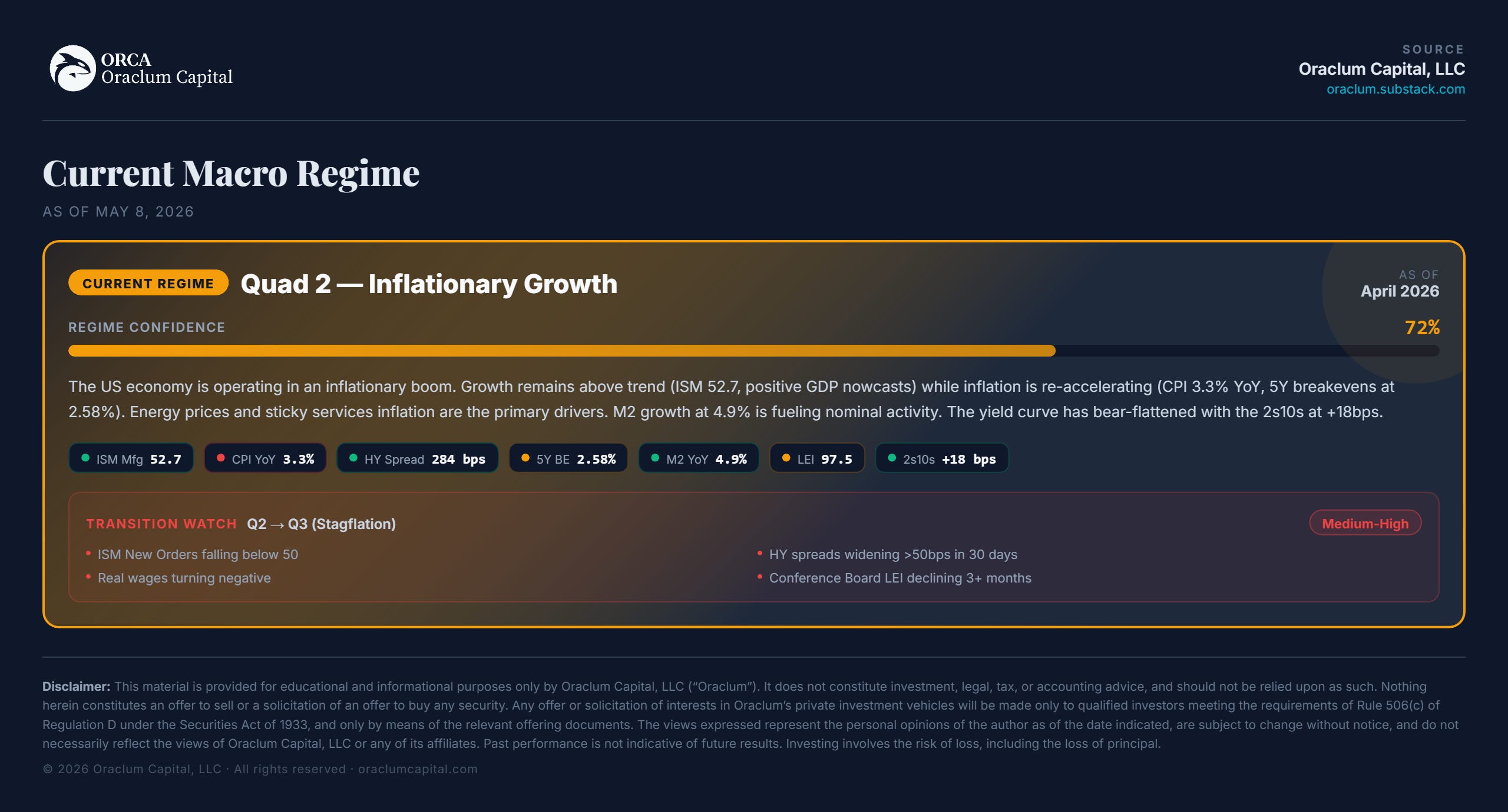
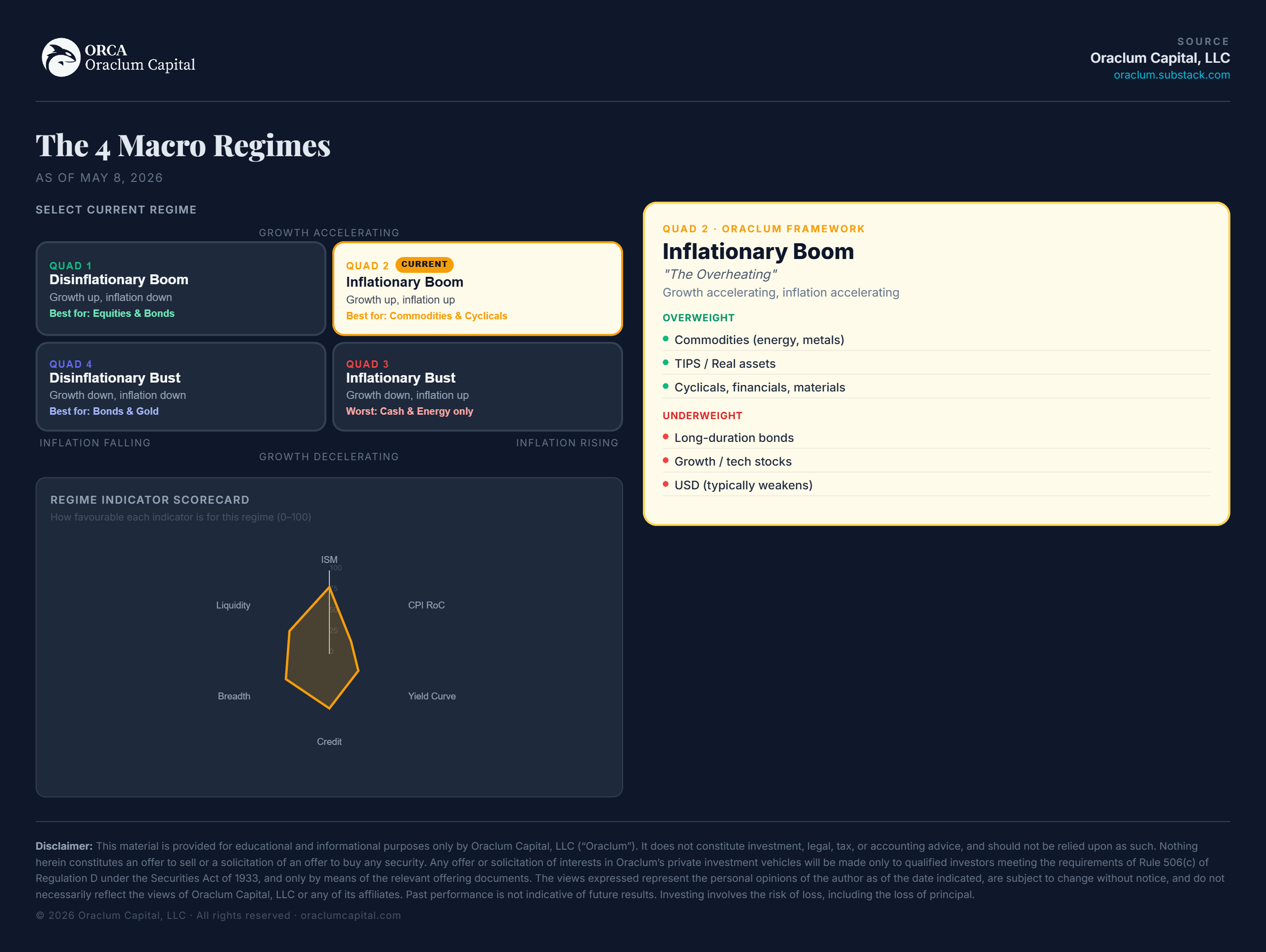
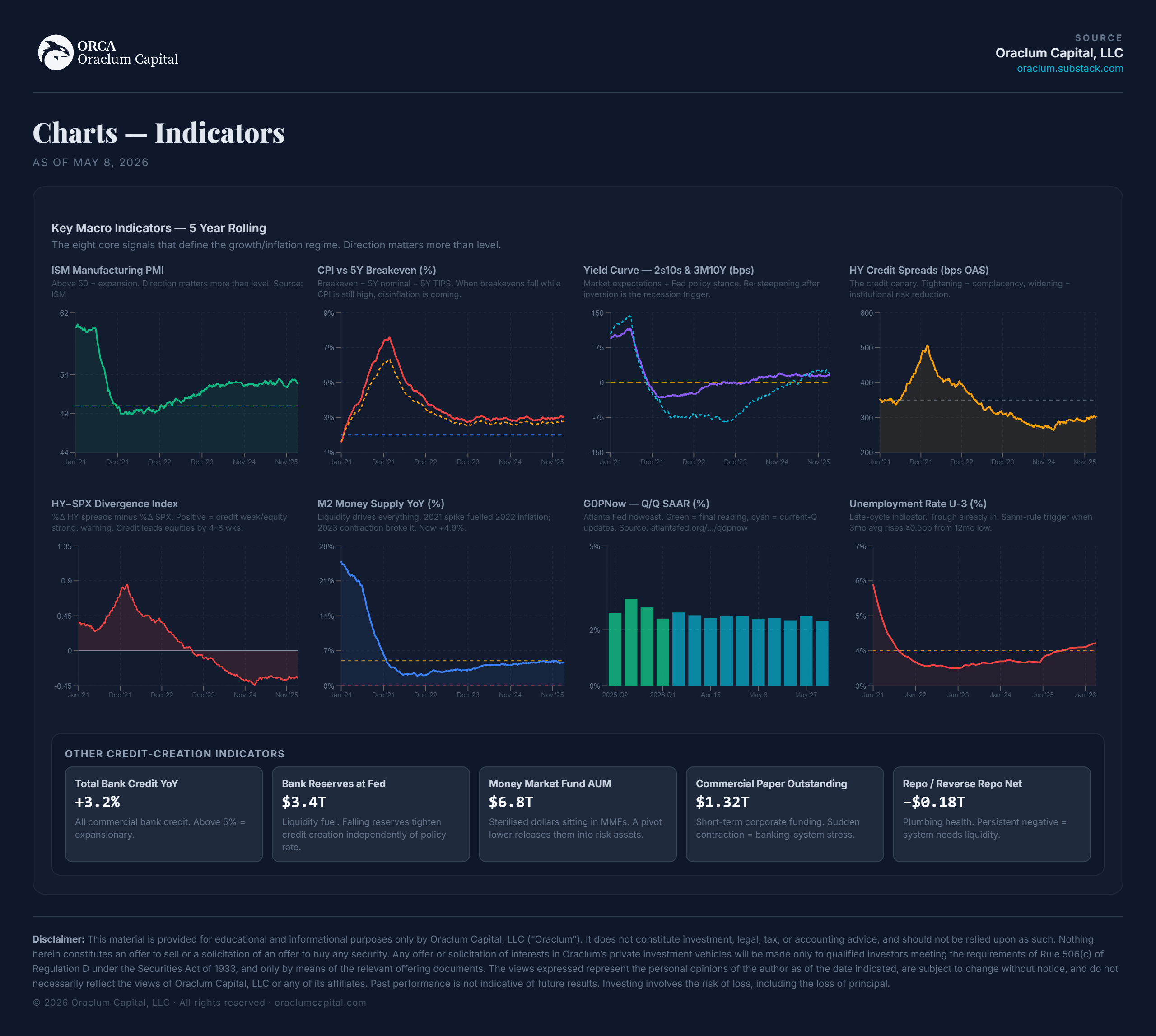
Four quadrants, depicting four regimes based on very simple measures of growth and inflation either accelerating or decelerating. Measured through a set of 6 key indicators: ISM manufacturing, CPI inflation, yield curve, credit creation, liquidity and market breadth.
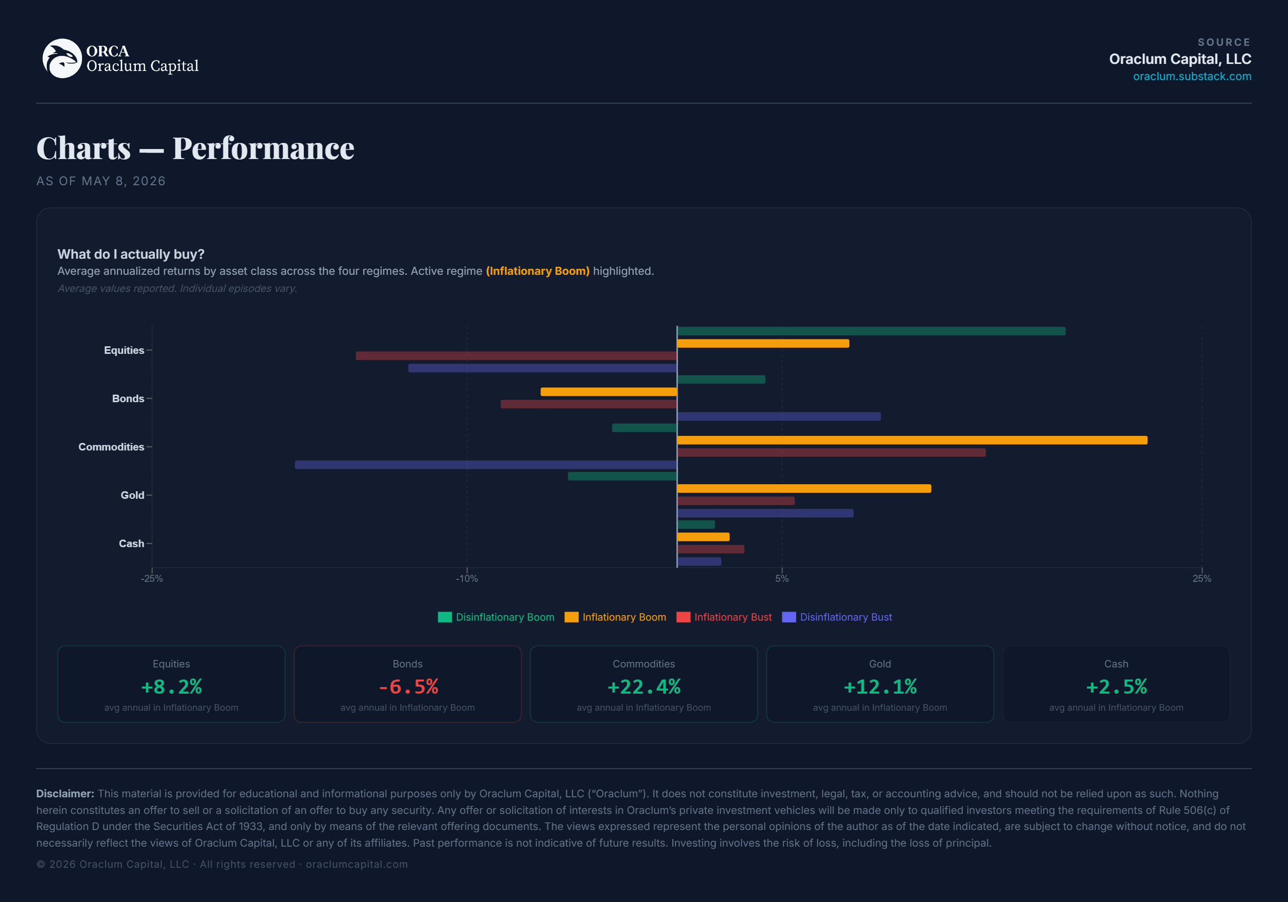
Right now we are clearly in an inflationary expansion phase - growth is accelerating, as is inflation, and the economy is generally in a good condition, but with signs of overheating. In this environment equities perform well, but so do commodities and gold (often outperforming equities). Bonds are underperforming.
Each quadrant has its own specifics of what defines a regime, and which asset classes tend to perform well in one regime versus another. I show all the historical episodes of the past 20 years, but the data spans more than 60 years in total.
The key is in figuring out when a transition is about to happen - this is what makes or breaks portfolios in certain years. That’s why there are so many indicators hoping to catch exactly that and position accordingly. And it will be expanded, updated and perfected before I launch it as a standalone thing (including not just cross-correlations, but also stock market analogs, technical positioning on markets, etc.).
That’s why I would value your feedback.
Actually, it makes sense you watch a video intro to the dashboard and let me know what you think.
Or if you don’t have the time now, check out some of the things we are looking at, from our series of Key Indicators:
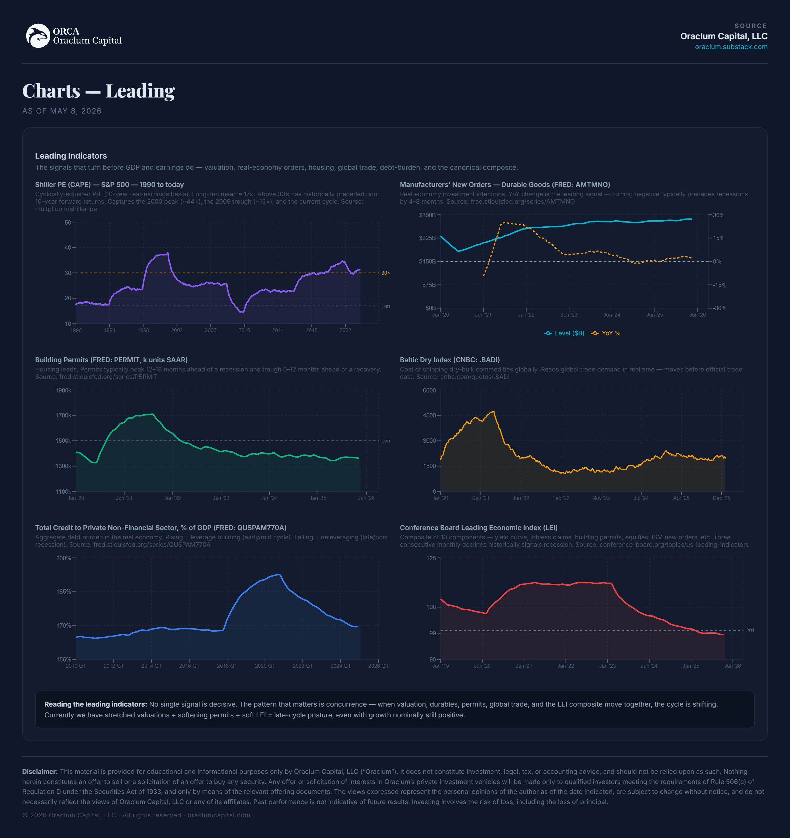
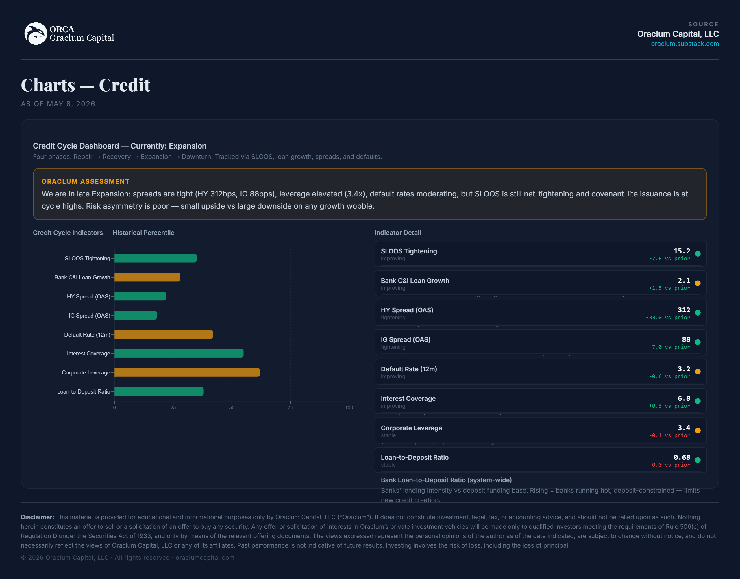
Also leading indicators and the very important and often underestimated credit cycle:
How to structure the portfolio based on all this? There’s that too, tailored to a specific regime:
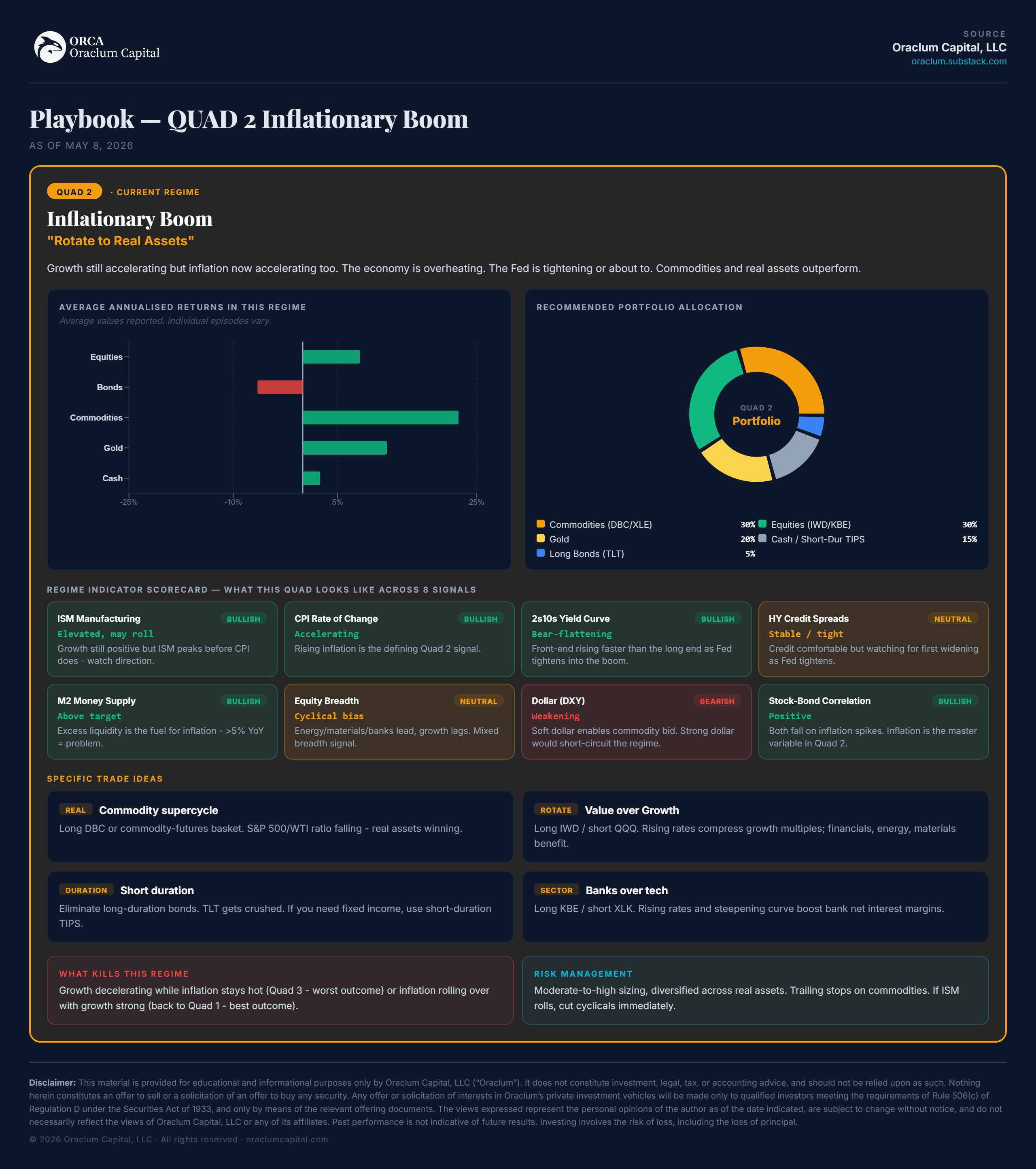
With each part telling me which indicators to watch and why.
The path tells the story. We’ve been bouncing between the right-side quadrants since late 2024, alternating between disinflationary growth and inflationary growth. The most recent four quarters in 2025 have all sat in the second quadrant.
The open risk now is a shift to the third quadrant - stagflation. That’s when growth starts to go down, while inflation is still high - economically the most dangerous transition (think 2021 into 2022). I’ll keep you updated on all the major indicators that may trigger this shift. Or we just might get away with it if inflation is curbed.
Follow us on this newsletter, it will make navigating all these regimes a bit easier.
Thanks for reading!
DISCLAIMER: Neither the survey nor any of the contents of this website can act as investment advice of any kind. The results of the survey need not correspond to actual market preferences or trends, so they should be interpreted with caution. Oraclum Capital, LLC (Henceforth ORCA) is a management company responsible for running the ORCA BASON Fund, LP, and for organizing a survey competition each week, where it invites the subscribers to its newsletter (this website) to participate in an ongoing prediction competition. The information presented on this website and through the survey competition should under no circumstances be used to solicit any investment advice, nor is it allowed to be of commercial use to any of its readers. The survey and this website contain no information that a user may use as financial or investment advice. All rights reserved. Oraclum Capital LLC.