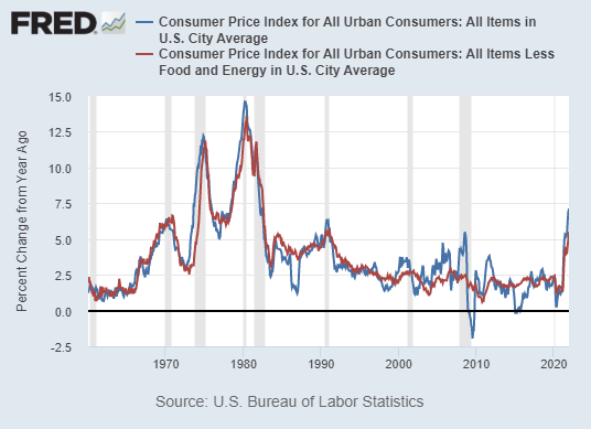
The key statistic that came out this week was the CPI number for January 2022. It presented inflation to be at a very high 7.5% for the past 12 month, growing an additional 0.6% in January (more than the consensus estimate of 0.4%). This makes it the highest inflation on record since 1982 (this is from a time when inflation was roaring in double digits before the “Volcker Moment”).
Many are pointing to the Fed’s massive expansion of its balance sheet for this inevitable outcome. After all, it was the great Milton Friedman that once said:
“Inflation is always and everywhere a monetary phenomenon.”
Not this time though. This time inflation is driven by something else.
Let’s dig in.
Is inflation “always and everywhere a monetary phenomenon”?
What Friedman meant with that statement is that inflation is always caused by an increase of money supply. In the vast majority of historical cases this is true. Think of hyperinflation episodes in Weimar Germany in the 1920s, Zimbabwe in 2008, Venezuela in 2019, or the galloping inflation in Turkey right now, etc. All these terrible inflation episodes were caused by what people usually refer to as senseless “money printing”.
But that’s not what happened in present-day United States.
Wait, we’ve all seen that graph suggesting a huge increase of M1 money supply in the US (the one that measures currency in circulation). Surely such a large expansion of M1 must be what caused inflation?
Not exactly. That graph is actually very misleading as there was a change in methodology in May 2020 that artificially increased M1. But more on that later.
Back to Friedman. The monetary phenomenon truism is derived from one of the central concepts of monetary economics, the quantity theory of money. It’s a very simple and straightforward concept, embodied in the following equation (also called Fisher’s equation):
MV = PQ
Where:
M - money supply
V- velocity of money
P - price level
Q - real GDP
The idea is the following: if real GDP (Q) and velocity of money (V) grow at a constant, predictable pace (which they usually do), any increase in money supply (M) should increase prices (P).
In most cases, yes, this is indeed true.
However, this is why I always point out to V, the velocity of money, which is locked rock-bottom during and post COVID (see graph below). Velocity of money measures the rate of circulation of money in the economy (nominal GDP divided by money supply). When it’s high, there is a lot of money circulating relative to the money supply. When it’s low, the opposite is true - less money in circulation relative to money supply.
You would expect V to be highly correlated with economic activity. As more people have jobs, and the economy is expanding, more money is circulating in the real economy. And usually that was the case. However, ever since the post-2008 quantitative easing (QE) policies from the Fed, the velocity of money indicator is no longer correlated with economic activity in general, and the employment-population ratio in particular.
What is the employment-population (E-P) ratio? It’s the best measure of labor market health. Much better than the unemployment rate, actually. Why? Cause it tells us how many people are working with respect to the entire population, whereas the unemployment rate simply tells us how many people are actively seeking for a job. The unemployment rate can go down if many people quit the workforce, but the E-P ratio won’t increase in that case (exactly what happened during the last recovery: the E-P ratio, i.e. the labor market, started recovering since 2014, not 2010).
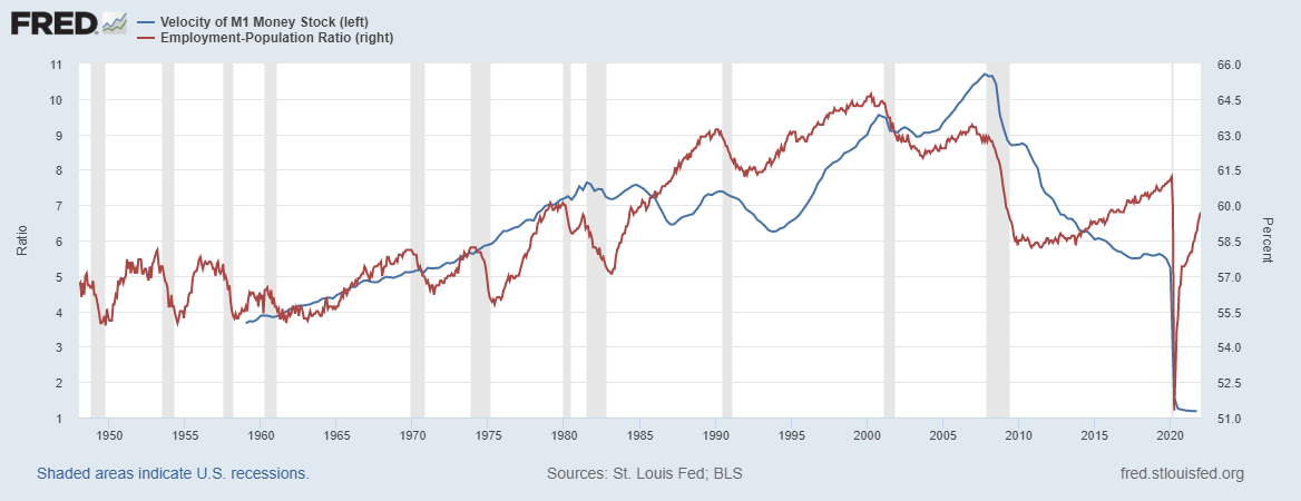
Typically V and E-P move in unison since more people having jobs means more spending, and more spending means that more money is circulating in the economy. However, ever since the Fed's QE policies of the past decade, that mechanism no longer seems to apply. The expansion of the money supply grew much stronger than nominal GDP, meaning that nominal GDP was not driven by excess money supply, or in other words: all this new money created is not being spent.
It is sitting in between banks and the central bank, as the following figure - excess reserves of depository institutions (i.e. banks) - clearly indicates.
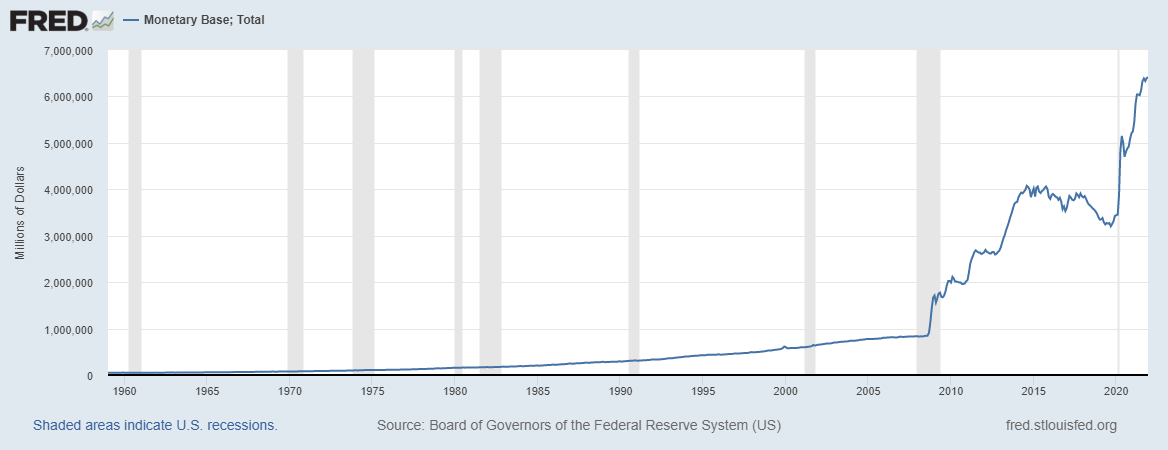
Note that this trend looks exactly like the Monetary base (M0) of the Fed. Because it is the same. Reserves of depository institutions are accounted for in the Fed’s balance sheet. In other words, this money never left the banks.
The M1 conundrum
Ok, but this is M0, monetary base, which includes currency in circulation plus central bank reserves. And the increase in M0 was driven mostly by central bank reserves. That is clear.
But what about that huge growth in M1?
Let’s unpack that.
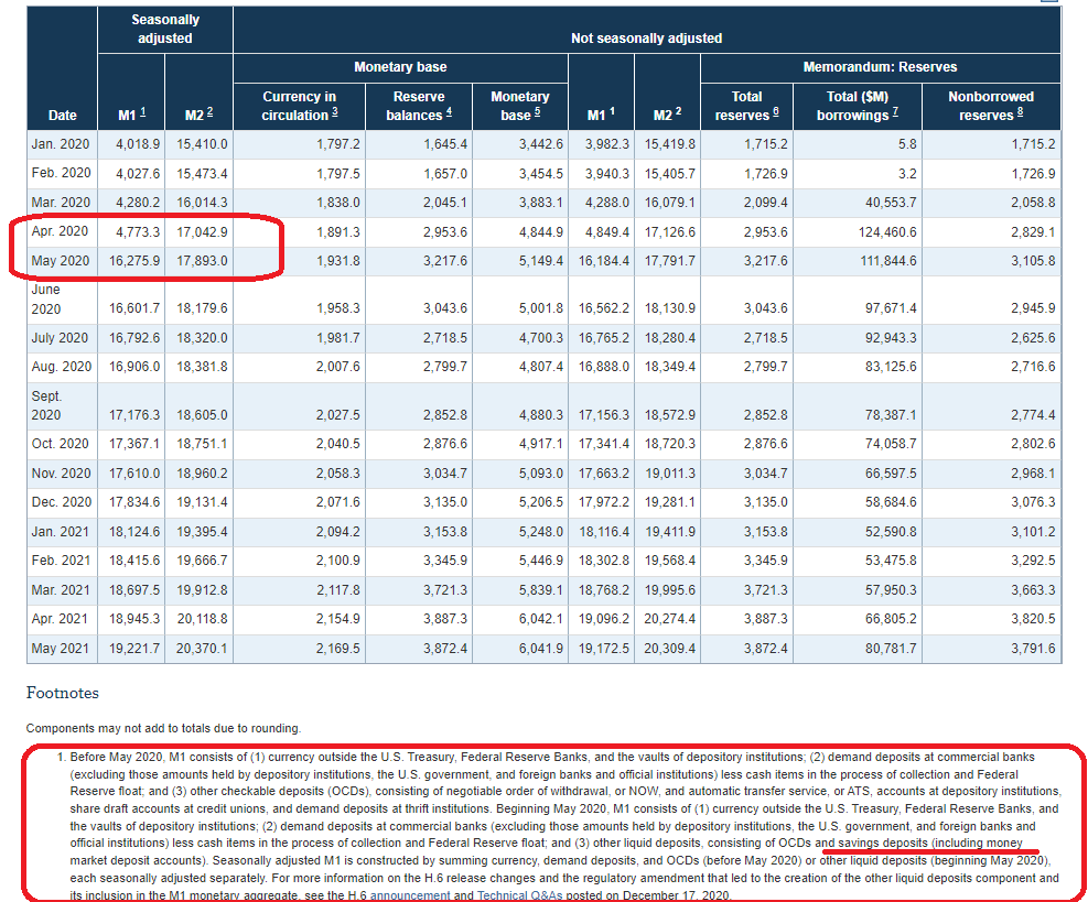
In April 2020, the Fed changed it's methodology to include savings deposits in M1. Why? Because they’ve eliminated the reserve requirements for all depository institutions, which means that it was no longer necessary to account savings deposits separately from money in circulation. Here’s an explanation.
The decision is warranted, but a bit ill-timed if you ask me, because it caused a lot of confusion, and the Fed never really communicated this coherently to the public.
Therefore, as of May 2020 (see Table screenshot below), savings deposits are no longer only in M2, but are also part of M1. This is why M1 went from 4.7bn to 16.2bn in one month.
The Fed didn’t “print” any of that money. It merely moved it from one account to the other (and M2 is unchanged since M2 consists of M1 plus a few other things).
It is true that currency in circulation also went up. In fact, it was increasing ever since 2008, as shown on the graph below. There was a slight pick-up of pace after 2020. These were the Trump and Biden stimulus checks during COVID. The currency circulation was more affected by fiscal policy than monetary policy, at least during the pandemic.
Keep in mind that money supply (M1 & M2), currency in circulation, and bank reserves all started going up ever since 2008, as a reaction to that crisis, mainly via QE policies. Look at the graph above - money in circulation doubled from 2009 to 2019. And yet there was no inflation.
Why? Because the post-2008 demand growth was sluggish. What we have seen back then were asset price bubbles in both equities and real estate. Remember that we had the longest ever bull market from 2009 to 2020. This was the consequence of QE then just as it is now. But we had no CPI inflation then.
COVID-induced supply chain issues
So what’s different between now and then?
COVID. More precisely, the lockdown-induced supply chain issues and huge post-lockdown demand that further exacerbated the supply chain problem.
Keep in mind that in 2021, when the reopenings and vaccinations started, there was a huge surge in demand to get us back to 2019 levels of spending. If something goes down 50%, it needs to increase 100% to get back where it was. And when demand for many goods falls rapidly as it did in 2020, and goes up even faster in 2021, the convexity is huge. The supply chain couldn’t cope with it. Taleb explains it well in 2 minutes:
A similar analogy is seeing 100 people walk into a restaurant all at once, and 100 people walking in throughout the day. In the first case, many people don’t get their meal. This is exactly how the supply chain crisis is affecting prices.
Huge demand + limited supply = high prices.
Let’s use an example to visualize this.
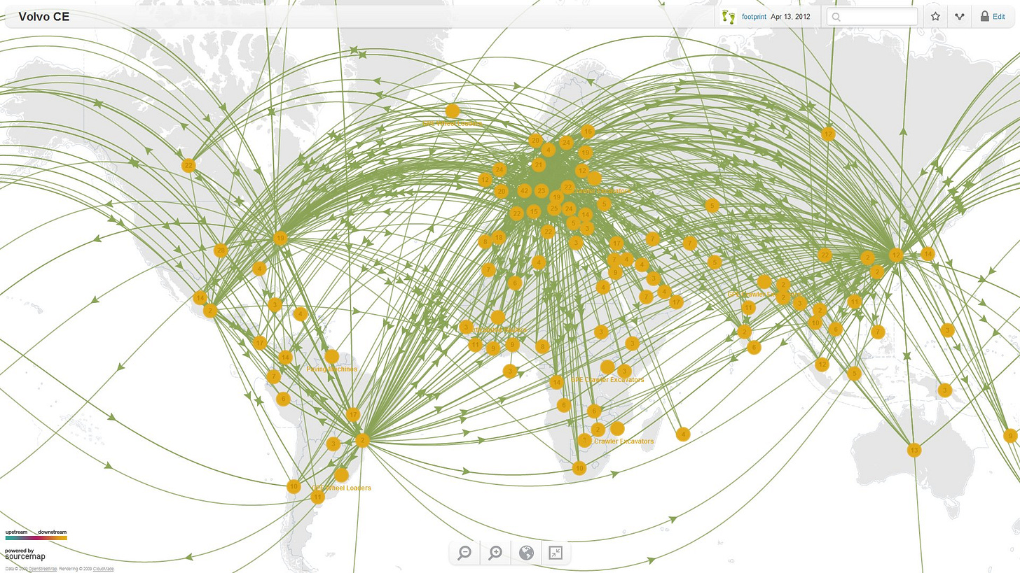
Here’s a neat map from Sourcemap showing the supply chain for the Swedish car company Volvo. Notice how many countries it takes Volvo and its main suppliers to get parts from, in order to assemble a car:
This supply chain has to be very quick and is highly sensitive to any shocks. So when the semiconductor shortage happened due to a shortage of silicon, affecting all tech goods, it affected cars as well (new cars need computer chips to run nowadays). One part being late sets production behind for months. And when production is late, this means lack of supply of new cars.
Now if demand for cars goes up, and supply of new cars is limited guess what happens?
Prices of used cars go up! Exactly what happened in 2021.
It was like this for most goods.
Take oil for example. Oil turned negative in April 2020, in the height of the first lockdown, ending the week at $16 p/barrel. Now it’s around $90. This is a 465% increase in less than 2 years!
Keep in mind that the biggest contributor to inflation last year were energy prices.
But we’re used to seeing volatile oil prices, right? They go up due to unexpected surges in demand, or through artificial limitations of supply (like during trade wars).
Apply the same logic to all other commodities. Before COVID firms kept large stockpiles of commodities they use in production: lumber, copper, platinum, iron, etc. Or agricultural goods like corn, wheat, cotton, etc.
When lockdowns started, trade flows of all these goods between the East & West stopped for a few months. So firms initially had to turn to their stockpiles. Remember that many production firms kept working during lockdowns (people still needed to buy food).
As the trade flows from the East stopped or were significantly reduced, Western production firms decided to shorten their supply chains. They found other suppliers of commodities and agricultural products, more closer to their domestic markets. This process is called reshoring or nearshoring (bringing production back to domestic markets or to nearby countries). This trend was exacerbated by numerous shortages facing domestic producers. But the new suppliers simply couldn’t cope with all this demand.
As economies started reopening in 2021, all production firms kept buying even more raw materials for two reasons: (I) to keep up with the rising demand for their products from the rest of the economy which is now recovering, and (II) to once again fill up on their inventories.
On the supply side, the new suppliers were struggling to keep up with the massive demand. Naturally prices go up.
Once again, limited supply + huge demand = high prices.
Just like the used cars market.
When will the supply chain crisis ease and what this means for markets?
Many indicators say that the supply chain issues are already easing and that inflation is peaking nowadays.
For example look at the BDI index, a key forward-looking indicator for international trade, measuring demand for shipping. It went down 75% since its October peak, meaning that the shipping industry adapted and produced more ships to chase all that cargo going around (recall the 70+ ships waiting in front of LA harbor). Back in November I suggested that this meant we will have a Christmas after all. And I was right. Its continued decline since December suggests the same thing: firms have filled up on inventories and are now demanding less stuff to be shipped around.
All other indicators suggest the same: inventories for durable goods are up, sales to inventories ratio is down, oil and gas price growth (biggest contributors to CPI) is easing, and even the stimulus check effects are abating.
Examine all of these encouraging trends:


US inflation is therefore peaking at its current 7-8% high, primarily because the supply chain crisis is finally easing. We’re not out of the woods yet, however. This entire year might still have above 3% inflation Y-o-Y.
Also, right now markets are still spooked and are anticipating several interest rate hikes this year. It’s already starting to flatten the yield curve, and the Fed hadn’t even raised rates. This is the power of market expectations.

The Fed is in a very tight spot. If it increases rates too much and meets markets’ expectations, a recession is likely (the yield curve inversion is inevitable in that case). The dollar futures market is already expecting rates to decline by 2024 (i.e., a new recession by then). The only hope is for inflation numbers to start slowing over the next few months (with the supply chain pressures easing this is likely), so that they don’t need to remain too hawkish and can deliver a soft landing, as opposed to the carnage happening now.
To sum up (TL;DR):
M1 “growth” was mostly a result of a methodology change. Real money supply growth was consumed by banks, and all that money is not circulating in the economy.
Fiscal stimulus checks and post-COVID supply chain disruptions had a much greater role in causing inflation. Fed raising of interest rates is more likely to affect asset price bubbles (equities and real estate). But inflation will come down as soon as the supply chain crisis is resolved.
This is already slowly happening, which gives Fed an opportunity not to create a self-fulfilling recessionary spiral. Let’s hope they take it.
Thanks for reading! Make sure to share and subscribe!







Great article. More insightful than a lot of the macro-economic chatter these days :)
Fascinating article. This changes my perspective significantly. I thought that the rising prices had a multivariate explanation, but my intuition was that it was at least 50:50 :: printing : supply chain issues. However , according to this, it's just supply chain.
This makes me weirdly optimistic, because it implies that our institutions aren't causing great harm by pursuing insane policies, rather that the problem is in the actual physical world.